Dear Victor, thank you very much for all the adjustment that you are carrying out and your kind help, I have carefully reviewed the data and I do not find any errors, but I think what is happening is that the Frequencies graph (colored by Clade) only presents the information for 2024 to me. Although my metadata and sequences.fasta have data from 2020 and I would like to see the distribution of clades through all the years in colors, this is it possible? Do I need to add something else to run this analysis? many thanks for everything. In the screenshot you will see that only clade 23I is represented in red because it only takes data from 2024.

Thank you for providing that information. The workflow should include all the available data by default, so we should inspect if something is causing it to remove some earlier data. Sorry that there are too many logs files to upload. The important files in your case are those for rule filter and rule subsample, which should be filtered_default-build.txt and subsample_default-build_all.txt.
Can you also confirm if the tree plot only has data from 2024?
Dear Victor, Thank you very much for your support, Regarding the tree, it does have all the information for the years studied from 2020 to 2024, the problem is in the Frequencies graph (colored by Clade)
filtered_default-build.txt (561 Bytes)
subsample_default-build_all.txt (209 Bytes)
Oh, it makes sense now! The reason for this behavior is not due to sampling, since the tree has the older data. Rather, it is due to the default behavior of the frequencies.min_date configuration:
default: without value supplied, defaults to 1 year before present
So you should add something like this to your config:
frequencies:
  min_date: "2020-01-01"
Sorry that I did not realize this earlier, but hopefully this is the final fix!
Thank you very much Victor, so I understand that I must add this configuration to the end of the config.yaml file and run the entire analysis again, right? And a second additional question, is there a way to directly download the graphics as pdf? Or only as a vector is that when you convert it to PDF, the names of the clades are misconfigured and the graph will not be displayed in a good way.
You will need to re-run at least rule tip_frequencies which generates the file used for the frequencies panel. If you are familiar with Snakemake, you can run targeting the output file results/default-build/tip-frequencies.json. It’s also fine to re-run the entire analysis.
The only screenshot method provided by the website is the SVG download. Your browser may have an option to print/save as PDF. What is wrong with the clade names? Whatever it is, you should be able to use SVG editing software to adjust the labels.
Dear Victor, very grateful for all your help, the clade frequency graph has now appeared! A couple of questions: 1. Why don’t you assign color to all clades? I need to add something else to the .yaml file 2. Any suggestions to improve the transmission graph? Is it possible to add representative data from the other countries or continents that they have by default? Or what would be your suggestion to better represent philodynamics, highlighting the Andean countries of Ecuador, Colombia, Peru and Bolivia? Please find attached the image.
nextstrain_ncov_default-build (7).rar (7.8 MB)
Hi Alfredo, that looks great! The grey color of early clades is intentional. If you want those clades to be included in the rainbow coloring scheme, you should add entries in the color_ordering.tsv file to match metadata values as described earlier in post #14.
If you want to add representative data from other countries, I suggest starting with the reference dataset that is updated regularly. The genomic surveillance configuration tutorial teaches how you can use this reference data in your config.yaml.
Also, if you aren’t familiar, take a look at our documentation page on sharing analyses – these are easier ways to share your analysis than large SVGs files!
Dear Victor, I am very grateful and would not have been able to obtain the graphics without your help and support. Could I do similar work specifically for human influenza, avian influenza H5 and RSV? I would like to go deeper with these analyses, which I find fabulous, but I don’t know if it will be as easy as what was done with COVID, since I already have the ncov folder with all the dependencies. In addition, if I require it, I could receive your support for subsequent analyses with these viruses. I am truly very grateful for your support and I would certainly 100% recommend the assistance provided.
Happy to help! Thank you for posting your questions in a public forum so other users can find answers if they have the same questions.
You can do similar work for other pathogens. The Nextstrain team maintains a core list of pathogens analyses, each of which link to a GitHub repository in under the title of the analysis. You are more than welcome to start your analyses from those repositories. Unfortunately, most other pathogen repositories do not have such extensive documentation and tutorials as the ncov (SARS-CoV-2) worfklow, and may vary in terms of implementation/configuration, however the same concepts should be applicable.
I encourage you to try those other viruses, and make new posts on this discussion forum if you have any troubles.
Dear Victori, an additional question: If I would like to change the colors of the countries in the tree graphic, could I configure the .yaml file like this?
Color settings for countries
colors:
default:
country:
China: “#FF0000” # Deep red
Bolivia: “#00FF00” # Strong green
Ecuador: “#0000FF” # Strong blue
Peru: “#FFA500” # Orange
Colors for specific values should be defined in a custom colors TSV file. See that documentation page for how to format and use the file.
You’re right that there is a colors entry in the workflow config file (.yaml), however it does not support specific values. You can see what’s supported on the workflow config file reference page.
Thanks Victor just to confirm if I’m right: 1. Create a colors.tsv file inside ncov/data where I put country, country and color code. 2. I modified the .yaml file including colors: data/colors.tsv 3. I attach the 2 configured files just for your review and if you consider if everything is ok
config_color.yaml (469 Bytes)
colors.tsv (136 Bytes)
I did not run to test, but the .yaml file does not look correct. This is what the guide says:
files:
  colors: "my-ncov-analyses/colors.tsv"
but your file has:
inputs:
  - name: reference_data
    metadata: data/TODO2.tsv
    sequences: data/TODO2.fasta
    colors: data/colors.tsv
The difference is in specifying it as files.colors vs. inputs.[].colors. Apologies, I realize that the workflow config file reference page does not have an entry for files.colors, but that should be the correct usage. I will update the documentation – pull request.
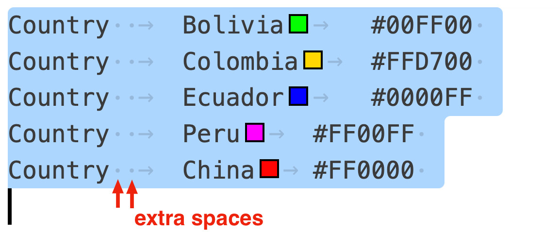
Dear Victor Please could you help me with that: In the list I specified in the colors.tsv file
config.yaml (564 Bytes)
nextstrain_ncov_default-build (9).rar (7.6 MB)
: Country Bolivia #00FF00
Country Colombia #FFD700
Country Ecuador #0000FF
Country Peru #FF00FF
Country China #FF0000 (this file is located within the data directory) and the configured .yml file (located within the ncov directory) you can see in the attached image that the countries have not taken the colors specified in the file, what could be the reason? Or do you think I need to do something else?
Dear Victor, thank you very much, the colors improved a lot with your instructions, could you help me with a recommendation in this regard? I realized that my analysis has a bias problem and I would like to try to analyze all the available sequences from these countries that are of good quality, giving a total of approximately 78,000 sequences. I have the sequences and the information very clear in the metadata. I no longer have any problem with them, but when running the analysis after 5 hours I get an insufficient memory message… is there a way to run limiting or expanding the memory so that the analysis does not end due to lack of memory? try this command:
export TMPDIR=/home/alfredo/tmp
nextstrain build . --cores 8 --configfile ALL.yaml --latency-wait 60 --resources mem_mb=16384
and the error message said this:
/logs/tree_default-build.txt:2:ERROR: Shell exited from fatal signal SIGKILL when running: iqtree2 -ntmax 8 -s results/default-build/masked_filtered-delim.fasta -m GTR -ninit 2 -n 2 -me 0.05 -nt AUTO -redo -ninit 10 -n 4 > results/default-build/masked_filtered-delim.iqtree.log
./logs/tree_default-build.txt:4: /bin/bash: line 1: 2310 Killed iqtree2 -ntmax 8 -s results/default-build/masked_filtered-delim.fasta -m GTR -ninit 2 -n 2 -me 0.05 -nt AUTO -redo -ninit 10 -n 4 > results/default-build/masked_filtered-delim.iqtree.log
./logs/tree_default-build.txt:9: iqtree2 -ntmax 8 -s results/default-build/masked_filtered-delim.fasta -m GTR -ninit 2 -n 2 -me 0.05 -nt AUTO -redo -ninit 10 -n 4 > results/default-build/masked_filtered-delim.iqtree.log
./logs/tree_default-build.txt:14:ERROR: Command '['/bin/bash', '-c', 'set -euo pipefail; iqtree2 -ntmax 8 -s results/default-build/masked_filtered-delim.fasta -m GTR -ninit 2 -n 2 -me 0.05 -nt AUTO -redo -ninit 10 -n 4 > results/default-build/masked_filtered-delim.iqtree.log']' returned non-zero exit status 137.
./logs/tree_custom-build.txt:3: iqtree2 -ntmax 8 -s results/custom-build/masked_filtered-delim.fasta -m GTR -ninit 2 -n 2 -me 0.05 -nt AUTO -redo -ninit 10 -n 4 > results/custom-build/masked_filtered-delim.iqtree.log
./results/default-build/masked_filtered-delim.iqtree.log:6:Command: iqtree2 -ntmax 8 -s results/default-build/masked_filtered-delim.fasta -m GTR -ninit 2 -n 2 -me 0.05 -nt AUTO -redo -ninit 10 -n 4
./results/default-build/masked_filtered-delim.fasta.log:6:Command: iqtree2 -ntmax 8 -s results/default-build/masked_filtered-delim.fasta -m GTR -ninit 2 -n 2 -me 0.05 -nt AUTO -redo -ninit 10 -n 4
./results/custom-build/masked_filtered-delim.iqtree.log:6:Command: iqtree2 -ntmax 8 -s results/custom-build/masked_filtered-delim.fasta -m GTR -ninit 2 -n 2 -me 0.05 -nt AUTO -redo -ninit 10 -n 4
./results/custom-build/masked_filtered-delim.fasta.log:6:Command: iqtree2 -ntmax 8 -s results/custom-build/masked_filtered-delim.fasta -m GTR -ninit 2 -n 2 -me 0.05 -nt AUTO -redo -ninit 10 -n 4
But it didn’t work and I tried all weekend without success. Could you help me with recommendations regarding this? dditionally increase the swap space memory to 20G. My laptop has 16 cores and 20G from memory for Ubuntu.

That is a large amount of sequences for both IQ-TREE and Nextstrain’s Auspice visualization. See this post for discussion on why it is failing, and this post for a reasonable sample size (generally 4,000 ~ 10,000). To obtain a smaller sample size, you can still start with all 78,000 samples and adjust subsampling options to preserve diversity and coverage across locations over time. This can be done with subsampling and builds.<build_id>.subsampling_scheme in your configuration .yaml file – see the genomic configuration surveillance tutorial for an example.